Mobile-First vs. Desktop-First: Choosing the Right Development Approach

Most platform decisions fail for one simple reason:
Teams pick a development approach before understanding how users actually behave.
“Mobile-first” became a default answer years ago. But default answers are dangerous. For some products, mobile-first is essential. For others, it quietly damages usability, conversion, and velocity.
This guide gives you a clear framework for platform prioritization—so you can choose between mobile-first and desktop-first development based on evidence, not trends.

What Mobile-First and Desktop-First Really Mean
Before comparing approaches, it’s worth clearing up a common misconception.
Mobile-first and desktop-first are development strategies, not just design preferences.
Mobile-First Development
Mobile-first means you design and build for the smallest screen and most constrained context first, then progressively enhance for larger screens.
Key characteristics:
- Core functionality designed for touch, small screens, and limited attention
- Performance and simplicity prioritized
- Desktop becomes an enhancement—not the baseline
Plug-and-Play Development Talent for Your Team
Desktop-First Development
Desktop-first means you design and build for large screens, precise input, and richer interactions first, then adapt down to mobile.
Key characteristics:
- Complex workflows designed upfront
- Dense information layouts
- Mobile experience is simplified from the desktop version
Both approaches can use responsive design. The difference is what you optimize for first.
Why Platform Priority Is a Business Decision
Choosing mobile-first vs desktop-first is not a design debate. It’s a business alignment decision.
The right approach depends on:
- Where users start tasks
- Where they finish them
- How much complexity is involved
- What success looks like
A mismatch here leads to:
- Friction in key flows
- Slower development cycles
- Poor conversion despite “good design”
Plug-and-Play Development Talent for Your Team
When Mobile-First Is the Right Choice
User Behavior Favors Mobile
Mobile-first makes sense when:
- The majority of sessions happen on mobile
- Tasks are short, frequent, and interrupt-driven
- Users act in real-world contexts
Examples:
- Consumer apps
- Content platforms
- Social, fitness, or travel products
If users primarily discover, engage, and complete actions on mobile, mobile-first is not optional.
Speed and Performance Matter Most
Mobile-first forces discipline:
- Smaller payloads
- Fewer dependencies
- Clear prioritization
This often leads to faster load times across all devices.
Your Product Has Simple Core Flows
Mobile-first works best when:
- Users complete one or two key actions
- Cognitive load is low
- Screens don’t require dense data
Trying to cram complex dashboards into a mobile-first approach creates compromises that hurt everyone.
When Desktop-First Is the Smarter Move
Users Do “Serious Work” on Desktop
Desktop-first is often correct when:
- Sessions are long and deliberate
- Tasks involve analysis or configuration
- Users rely on keyboards, shortcuts, or multiple windows
Examples:
- SaaS dashboards
- Developer tools
- Enterprise software
In these cases, mobile usage may exist—but it’s secondary.
Information Density Is Critical
Some products need:
- Tables, charts, and side-by-side views
- Advanced filtering and bulk actions
- Multi-step workflows
Designing these mobile-first often leads to oversimplification that reduces product value.
Your Sales or Activation Happens on Desktop
If conversion, onboarding, or configuration happens primarily on desktop, that should guide platform prioritization—regardless of traffic stats.
Mobile-First vs Desktop-First: Side-by-Side Comparison
| Criteria | Mobile-First | Desktop-First |
|---|---|---|
| Primary Use Case | Quick actions, frequent use | Complex tasks, deep work |
| User Context | On-the-go, distracted | Focused, seated |
| Design Constraint | Screen size, touch | Space, precision |
| Performance Pressure | Very high | Moderate |
| Information Density | Low–medium | High |
| Common Risk | Oversimplification | Poor mobile usability |
This comparison highlights the real tradeoff: simplicity vs depth.
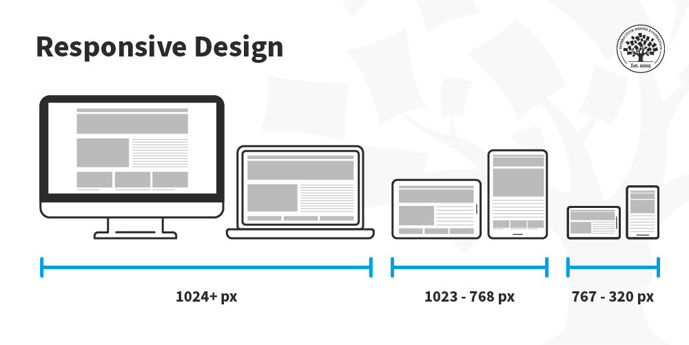
Responsive Design Strategy: The Missing Middle
Many teams think responsive design solves everything. It doesn’t—by itself.
A strong responsive design strategy still requires choosing a primary context.
Progressive Enhancement vs Graceful Degradation
- Mobile-first uses progressive enhancement
- Desktop-first uses graceful degradation
Neither is inherently better. What matters is choosing intentionally and designing flows—not just layouts—accordingly.
Plug-and-Play Development Talent for Your Team
A Simple Framework for Platform Prioritization
Use this framework to decide quickly and defensibly.

Ask these questions in order:
- Where do users complete the primary task?
- How complex is that task?
- What environment are users in when doing it?
- What platform drives revenue or retention?
If most answers point to mobile → mobile-first.
If they point to desktop → desktop-first.
Mixed answers often mean dual-priority design, not a default stance.
Common Mistakes Teams Make
- Choosing mobile-first because “Google recommends it”
- Using traffic volume instead of task completion data
- Designing layouts instead of workflows
- Treating mobile as a shrunken desktop
These mistakes lead to products that technically work—but feel wrong.
FAQs: Mobile-First vs Desktop-First Explained
Is mobile-first always better for SEO?
No. Mobile-first indexing affects crawling, not your development strategy. Usability and performance matter more than ideology.
Can you switch from desktop-first to mobile-first later?
Yes, but it’s costly. Platform priority affects architecture, not just UI.
What if users split evenly between mobile and desktop?
Prioritize based on task complexity, not session count. Where users finish matters more than where they start.
Does mobile-first mean building a mobile app first?
No. Mobile-first applies to web and app development. It’s about constraints, not platforms.
Is responsive design enough?
Only if it’s paired with intentional platform prioritization. Responsiveness alone doesn’t guarantee usability.
Conclusion: Optimize for Reality, Not Trends
Mobile-first and desktop-first are tools—not doctrines.
The right choice aligns:
- User behavior
- Business outcomes
- Technical constraints
When platform prioritization is intentional, teams move faster, design better flows, and avoid costly rewrites.